2023 | Finally App: Transforming Fitness Through Community and Rewards

Overview
Role
UX/UI Designer
Team
UX/UI Designers (me), one Front-end Developer and one Back-end Developer.
Timeline
4 Months
Tools Used
Figma
The 'Finally' app is a fitness platform designed to motivate users to exercise consistently by offering cash rewards for achieving their fitness goals. With a focus on long-term behavior change, the app aims to enhance users' overall health and well-being.
In addition to the rewards, 'Finally' fosters a supportive community of like-minded individuals who can inspire and encourage each other on their fitness journeys.
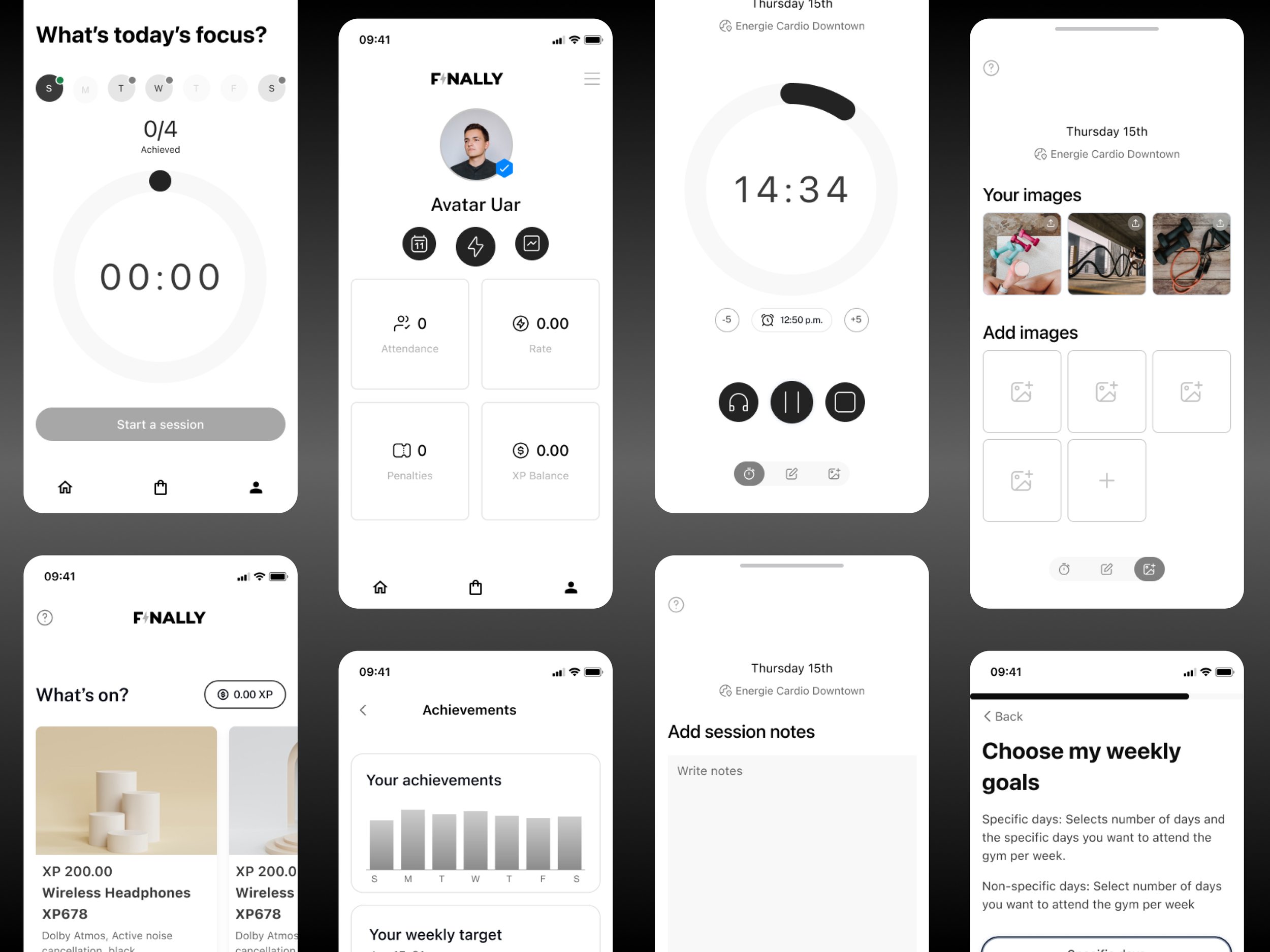
Users can set personalized exercise goals, track their progress, and earn financial incentives upon reaching their milestones. To help users stay on course, the app includes a variety of features such as daily workout reminders, progress tracking, music integration for enhanced workouts, and the ability to log progress through notes or photos. Users can also share their achievements on social media, making it easy to celebrate milestones and stay accountable.
The Objective
Motivate users to exercise:
The app must be easy to use, offer personalized workout plans, and keep users engaged with varied challenges and competitions.
Track user progress:
A strong tracking system is needed to give real-time feedback, allowing users to monitor their fitness progress effectively.
Incentivize fitness goals:
The app requires a reliable payment system to deliver timely and valuable rewards, keeping users motivated to meet their targets.
Competitive Research & Analysis
User flows & Journeys
The Process
After researching competitors, I found that fitness apps using monetary rewards motivate consistent exercise, as financial incentives drive better results. Most apps verify users’ progress, such as weight loss, and offer cash or other rewards.
To begin the design process, I mapped the primary user flow, covering everything from onboarding to completing sessions and cashing out rewards. With a clear understanding of the flow, I developed a basic UI kit to later design wireframes and high-fidelity prototypes.
Following several rounds of client feedback and iterations, I structured the files around critical user journeys, outlining all possible paths a user can take. These interactive prototypes are designed to ensure a seamless handoff for developers
The solution & impact
I designed the app using a persona informed by secondary research, including competitive analysis and client insights.


