
2022
Qatanel
Overview
Role
UX/UI Designer
Timeline
10 Month
Platform/medium
Responsive Website
Tools Used
Figma
Qatanel emerged from a personal experience while travelling across central America.
Qatanel's creator found it challenging to navigate their bus system as he needed to familiarize himself with how bus companies operate, and he, too, had a language and cultural barrier. Also, there was little to non-information online about bus routes. And to add to the inaccessibility, Google maps has zero information about it, which is often problematic because it is often the tool we use to plan trips.
The only way to find information was through Facebook groups or travel blogs on how to find bus routes, schedules or prices.
We saw a real opportunity to help the local community access the tourism economy and help tourists trip to Costa Rica with the centralization of information.
The Challenge
According to UN-Habitat, Latin America is the most urbanized region globally. The number of regional cities has increased six times in 50 years, but public transport has yet to follow this growth. In Costa Rica, there’s no unified national bus network.
As a result, tourists encounter informal bus companies operating throughout the country, and only locals know how each bus operator works, making the information inaccessible to tourists mainly because of a language barrier.
Qatanel aims to centralize that knowledge so tourists access it anytime and travel with autonomy.
We want tourists visiting Costa Rica to adventure new routes and give them the independence to plan their trip customizable for their needs (price and time). The main challenge is the need for online data on routes, schedules, bus stops and prices. Qatanel aims to put that information online.


The Approach
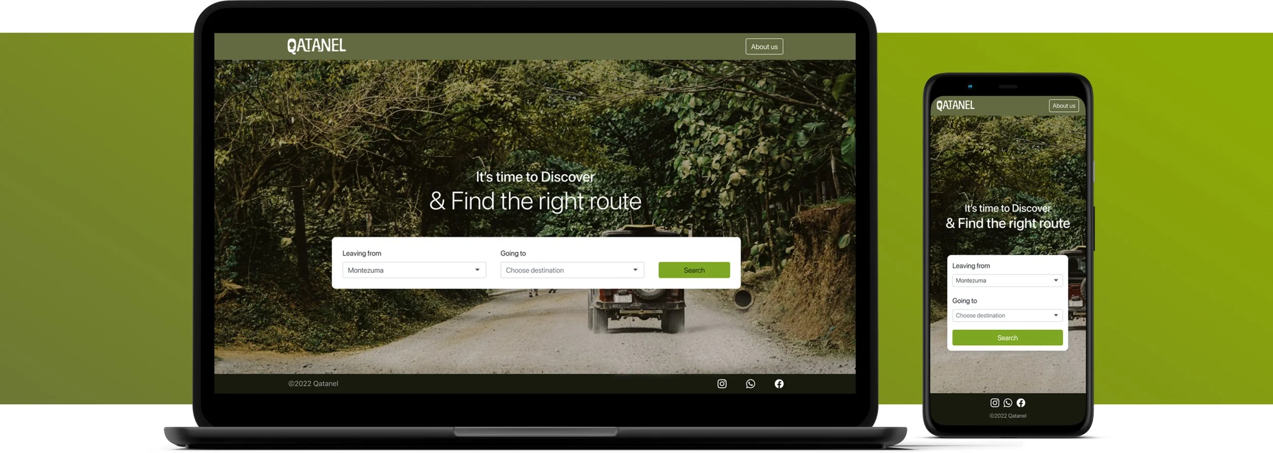
We propose to create a website following similar design patterns to google maps. Why? Because Google Maps has 154.4 million monthly users, we want to reduce cognitive load by following an established design pattern many already recognize and use.
So similarly to Google maps, a user can look up a route from point A to point B, and the algorithm will throw three kinds of results: the fastest way to get to point B, the cheapest and the easiest way.
My role then as a designer is to present such information in a digestible and easy-to-scan UI. My process started by making a competitor benchmark research, followed by a mood board inspiration to evoke a sense of travelling across Central America.

Preliminary logo iteration

Logo moodboard

Logo iterations with color
The Process
Since I was the only designer in the group, I was responsible for the UX/ UI development and creating a cohesive branding guide for the website.
It included creating a logo and choosing the colour palette, typography, iconography and general design patterns for forms, inputs, buttons, etc.
Anyone who has used Google maps before can find a route in Qatanel.
I started by mapping out the user flow through the site. And continued by creating a wireframe of my understanding of the website, but I soon realized that it needed to be more straightforward than we wanted. So after more iterations, the number of clicks finally reduced, resulting in a relatively simple flow.
Then I integrate the brand styling into the wireframes for mobile and desktop views.
The Results, So Far…
We wanted to create a rapid prototype and make it accessible to the public as an MVP. Since we do not have a budget to perform user research or usability testing. We instead added a ‘feedback input’ to get insights into real users. It will allow us to keep improving the website and the service sustainably.
Visit Qatanel.com